
Designing for Every Mind: How Stair Nosings, Flooring Accessories and Colour Can Support Neuroinclusive Buildings
A practical guide for architects, interior designers, specifiers and facilities managers
By Quantum Flooring Accessories
Introduction: Inclusive design starts from the ground up
When designing an inclusive building, attention often focuses on entrances, doorways, circulation widths and accessible facilities. Yet one of the largest and most frequently encountered surfaces in any building is the floor.
The way a floor looks, feels, sounds and connects with adjoining surfaces can influence how people understand and navigate their surroundings. For people who experience differences in sensory processing, visual perception, attention or information processing, these details may be particularly important.
Neurodiversity encompasses a wide range of neurological differences, including autism, ADHD, dyslexia and other ways of processing information. People within these groups do not all experience the built environment in the same way. Some may be sensitive to strong colours, repetitive patterns, glare or unexpected sensory changes. Others may benefit from clear visual cues, consistent layouts and easily recognisable routes.
This presents an important opportunity for the flooring industry.
Stair nosings, transition profiles, entrance matting, floor trims, skirtings and other flooring accessories may appear to be small components within a wider building design. However, when specified as part of a coordinated strategy, they can help create spaces that are easier to interpret, safer to navigate and more comfortable to use.
For Quantum Flooring Accessories, the challenge is not simply to provide products that meet technical requirements. It is to help designers understand how the selection, colour and positioning of flooring accessories can contribute to a more inclusive built environment.
- What does neuroinclusive design mean for flooring?
Neuroinclusive design recognises that people perceive and interact with their surroundings differently. Rather than expecting every person to adapt to the same environment, designers can reduce unnecessary barriers and make spaces easier to understand.
The British Standards Institution’s PAS 6463:2022, Design for the mind: Neurodiversity and the built environment, provides guidance on designing buildings and external spaces that take account of sensory and neurological processing differences. Its scope includes flooring, décor, lighting, acoustics, layout, wayfinding and safety. [1]
For flooring specifications, three principles are especially useful.
Clarity
People should be able to distinguish important features without having to interpret an unnecessarily complicated visual environment.
Floor transitions should make sense. Stair edges should be identifiable. Thresholds should not introduce unexpected obstacles, and circulation routes should be easy to follow.
Consistency
Repeated features should behave and appear in predictable ways.
Consistent stair-nosing profiles, coordinated transition trims and a coherent approach to colour can help reduce unnecessary variation throughout a building.
Sensory consideration
Colour, pattern, reflection and texture should be selected with the wider environment in mind.
A highly patterned floor, reflective metal trim or abrupt change in flooring colour may be distracting or uncomfortable for some people. Equally, removing all contrast can make hazards harder to identify.
The objective is to balance a calm visual environment with the contrast and definition required for safe movement.
- Colour: Why specification matters more than brightness
Colour is one of the most visible elements of flooring design, but there is no single colour palette that makes a building neuroinclusive.
Some people prefer subdued colours and low visual stimulation. Others may find colour coding helpful when identifying different rooms, departments or routes. Individual preferences can also change according to lighting, familiarity and the demands of the environment.
The most useful approach is to give colour a clear purpose.
Use colour to communicate, not decorate unnecessarily
Colour can help distinguish a doorway, identify a route or highlight an important architectural feature. However, using multiple competing colours without a clear system can make the environment harder to interpret.
A coordinated scheme might use a restrained palette for the main floor and walls, with carefully selected contrasting details at stair edges, doorways and other critical points.
Where colour is used for wayfinding, its meaning should remain consistent. If one colour identifies a particular route or department, changing that meaning elsewhere can undermine the system.
Understand Light Reflectance Value
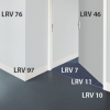
Light Reflectance Value, or LRV, is a measure of how much visible light a surface reflects. Values range from 0 for an idealised black to 100 for an idealised white.
LRV is important because two finishes that look different in a colour chart may have insufficient tonal contrast when installed together.
For example, a medium-grey stair nosing against a medium-grey tread may be difficult to distinguish, even if the finishes have slightly different undertones.
Conversely, a carefully selected darker nosing against a lighter tread may create clear visual definition without introducing an excessively vivid colour.
PAS 6463 advises designers to provide sufficient visual contrast for navigation while avoiding unnecessary visual disturbance from highly contrasting patterns. It also cautions that abrupt contrasts between adjoining floor finishes can cause difficulty for some users. [1]
The important distinction is between useful contrast at a genuine hazard and unnecessary contrast across an otherwise continuous floor.
Where accessibility guidance specifies an LRV difference, the design team should calculate and verify that difference using appropriate product data. A visual judgement alone is not sufficient.
- Stair nosings: Clear step definition without unnecessary visual disturbance
Staircases present a particular design challenge because the leading edge of every step needs to be identifiable.
For people with visual impairments, an indistinct step edge can increase the risk of a misstep. For some neurodivergent people, inconsistent stair finishes, complicated patterns or unexpected changes in appearance may also make a staircase more difficult to interpret.
The solution is not to eliminate contrast. It is to apply it deliberately and consistently.
Make the edge of every step clear
A properly specified stair nosing can provide a defined visual band at the front of each tread.
The profile should be consistent across the staircase, with a finish that contrasts appropriately with the surrounding tread and riser. The band should extend across the required width, and the nosing should be securely fixed with a suitable, slip-resistant surface.
Approved Document K and the relevant accessibility guidance should be consulted when determining the required stair-nosing dimensions and visual treatment. For accessible environments, BS 8300 also provides relevant guidance on step definition and visual contrast.
Avoid confusing decorative effects
Strong stripes, complicated graphics and highly contrasting patterns can sometimes be mistaken for changes in level or create unnecessary visual distraction.
This does not mean that all patterns or colours are unsuitable. It means that decorative features should not compete with the information needed to recognise the step edge.
A simple, continuous contrasting band is generally easier to interpret than a collection of unrelated colours and patterns.
Keep the design consistent throughout the flight
A staircase with alternating nosing colours, inconsistent profiles or irregular visual bands may be more difficult to read than one in which the same design is repeated consistently.
For new-build and refurbishment projects, specifiers should coordinate the nosing, tread covering and riser finish before installation.
For Quantum Flooring Accessories, the opportunity is to help designers select stair nosings that balance reliable physical performance with clear, predictable visual definition.
Safety requirements must remain paramount. Neuroinclusive design should complement, not compromise, the visual contrast needed to identify a genuine change in level.
- Flooring transitions: Small details that influence how a space is understood
Transition profiles are frequently specified to join two floor coverings, protect exposed edges and create a neat finish between adjoining materials.
From a neuroinclusive perspective, their role extends beyond appearance.
An unexpected change in colour, texture or height can make a route less predictable. For some people, a strong visual line across a continuous floor may be interpreted as a barrier or a change in level, even where the surface remains level.
The design team should therefore consider both the physical and visual characteristics of a transition.
Make changes between floor finishes predictable
Where two floor coverings meet, the transition should be appropriate to the floor build-up and should not introduce an avoidable trip hazard.
Where the floor remains level, a visually subtle transition may be preferable if a strong contrasting band would imply an obstacle that does not exist.
Where there is a genuine change in level, the design must communicate that change appropriately and satisfy the relevant accessibility and safety requirements.
The distinction matters: a calm appearance should never be achieved by concealing a real hazard.
Choose the right profile for the installation
Transition profiles should be selected according to the floor coverings, thicknesses, substrate, traffic conditions and accessibility requirements.
The profile should be securely fixed, suitable for the expected use and detailed to minimise unnecessary projections.
A well-coordinated transition can make a change in flooring material look intentional rather than accidental, helping the overall environment remain visually coherent.
- Entrance matting: Preparing people for the building
Entrance areas are often among the busiest and most visually complex parts of a building.
People may be arriving from outdoors, looking for directions, managing bags or navigating crowds while encountering changes in lighting, sound and floor texture.
Entrance matting has an important functional role in removing moisture and dirt from footwear, helping to maintain floor cleanliness and reduce slip risks.
However, its visual treatment also deserves consideration.
A very dark mat set into a much lighter floor can create a strong boundary. A heavily patterned mat may compete with nearby signage or other wayfinding information.
For some users, such contrasts may be distracting or may make the entrance appear to contain a change in level.
Practical design considerations
- Coordinate the matting colour with the surrounding floor finish, taking account of any genuine level changes.
- Avoid unnecessary patterns that compete with signage or other important visual information.
- Ensure the matting system is securely installed, stable and appropriate for the traffic conditions.
- Provide a suitable transition between the mat and adjoining flooring.
- Consider lighting and reflections when reviewing the completed entrance.
A well-designed entrance should communicate a clear route into the building while fulfilling its essential moisture-control and safety functions.
- Skirtings, edge trims and floor boundaries
The junction between a floor and a wall can help people understand the shape and extent of a room.
In some environments, a clearly defined boundary can aid orientation. In others, strong contrasting lines running around the perimeter of the room may introduce unnecessary visual complexity.
Skirtings and edge trims should therefore be considered in relation to the wider interior scheme.
A coordinated finish can help distinguish the wall from the floor without making the room feel visually fragmented.
Where contrast is needed to identify a significant feature, it should be selected intentionally rather than applied indiscriminately to every junction.
The same principle applies to exposed floor edges and perimeter profiles. They should protect the installation and create a clean finish without introducing unnecessary projections, sharp edges or distracting visual patterns.
- Texture, reflection and sensory comfort
Neuroinclusive flooring design is not solely about colour.
Surface texture, gloss, lighting and sound can all influence the experience of moving through a building.
Some people may find reflective surfaces, repetitive patterns or abrupt changes in texture uncomfortable or distracting. Others may benefit from tactile information, provided it is relevant and predictable.
The design objective is to choose materials that perform well while avoiding unnecessary sensory complexity.
Avoid excessive glare
Highly reflective metal finishes and glossy flooring can produce reflections that change with the lighting conditions.
Where practical, designers should consider how the floor and accessories will appear under daylight, artificial lighting and changing viewing angles.
Physical samples and on-site mock-ups can help identify reflections or visual effects that are not apparent on a product data sheet.
Keep transitions physically comfortable
Flooring accessories should provide an appropriate, stable junction between materials.
Changes in height, loose edges or abrupt transitions can affect people using wheelchairs, walking aids, pushchairs and other mobility equipment, as well as people who may find unexpected changes difficult to navigate.
The appropriate profile should be selected for the actual installation rather than choosing a product on colour or appearance alone.
Consider the sound of movement
Flooring, matting and adjoining surfaces can affect the sound generated by footsteps, wheels and other movement.
Acoustics are especially important in busy public environments, healthcare settings and educational buildings. Flooring accessories form only one part of the overall acoustic design, but the selection of finishes and the coordination of adjoining materials can contribute to a more considered environment.
- Using colour for wayfinding without creating confusion
Colour can be a useful component of a wayfinding strategy when it is applied consistently and supported by clear signage.
For example, a healthcare building might use a consistent colour scheme to distinguish departments, while an educational building might use colour to reinforce room identification or circulation routes.
Flooring accessories can support this approach by creating coordinated transitions between different areas or by providing a consistent finish around the perimeter of a space.
However, colour should not be the only means of communicating essential information.
A route should remain understandable through appropriate signage, spatial layout and other cues. This is particularly important because people differ in colour perception, visual acuity and their familiarity with the building.
Designers should also consider whether a colour change on the floor might imply an obstacle or change in level where none exists.
The best wayfinding schemes use colour as one part of a coherent information system rather than relying on colour alone.
- Applying neuroinclusive principles across different environments
The same design principles can be applied to many building types, but the priorities will vary.
Education
Schools, colleges and universities need flooring systems that can withstand intensive use while supporting clear circulation and recognisable spaces.
Consistent stair nosings, well-detailed transitions and a restrained approach to decorative floor patterns can contribute to a more legible environment.
Healthcare
Hospitals and healthcare facilities must balance sensory considerations with infection control, slip resistance, accessibility and operational demands.
Flooring accessories should be compatible with the specified floor system and cleaning regime. Visual contrast should be used purposefully to identify genuine hazards and important features.
Offices and commercial buildings
Workplaces can benefit from coordinated floor finishes, clear routes and a consistent approach to transitions and thresholds.
A restrained visual scheme can help reduce unnecessary complexity, while appropriately placed contrast can support navigation.
Railway stations and transport hubs
Transport environments introduce additional challenges, including crowds, time pressure, changing light conditions, wet-weather contamination and complex wayfinding.
Stair nosings must provide suitable step definition and slip resistance, while transitions and entrance matting must be robust enough for heavy pedestrian traffic.
Neuroinclusive design should be coordinated with station accessibility guidance, tactile information, signage, lighting and the relevant infrastructure owner’s technical standards.
No single flooring accessory can make a transport hub fully neuroinclusive. The greatest benefit comes from a coordinated approach across the entire passenger journey.
- A practical checklist for architects and specifiers
When reviewing flooring accessories for a neuroinclusive project, consider the following questions.
Colour and contrast
- Does each contrasting feature communicate something useful?
- Is the required LRV difference supported by technical data?
- Could a change in floor colour be mistaken for an obstacle or change in level?
- Are the finishes appropriate under the expected lighting conditions?
Stair nosings
- Is the step edge easy to identify?
- Is the profile consistent across the staircase?
- Does the product meet the required dimensional and slip-resistance criteria?
- Is the contrast sufficient without introducing unnecessary decorative complexity?
Transitions and thresholds
- Is the transition appropriate for the actual floor build-up?
- Is the finished junction stable and free from avoidable trip hazards?
- Does the visual treatment accurately communicate any change in level?
Entrance matting and perimeter accessories
- Is the matting suitable for the anticipated footfall and environmental conditions?
- Are the adjoining finishes visually coherent?
- Are edge trims and skirtings securely installed and appropriate for their location?
The wider environment
- Have lighting, reflections, patterns and acoustics been considered?
- Is colour coding consistent with the wider wayfinding scheme?
- Have the needs and preferences of intended users informed the design?
- Has the completed installation been reviewed in context?
Conclusion: Better details, more inclusive buildings
Neuroinclusive design does not require every building to adopt the same colours, finishes or flooring accessories.
It requires designers to think carefully about how people interpret the spaces around them, and to recognise that apparently minor details can affect comfort, orientation and confidence.
For stair nosings, that means providing clear and consistent step definition while maintaining appropriate slip resistance. For transition profiles, it means creating safe, predictable junctions without unnecessary visual signals. For entrance matting, skirtings and edge trims, it means balancing practical performance with a coordinated and legible interior scheme.
Colour should be purposeful. Contrast should communicate useful information. Patterns and reflections should be considered in context, and genuine hazards must remain clearly identifiable.
For Quantum Flooring Accessories, these principles provide a practical foundation for working with architects, designers and contractors to create flooring specifications that support a wider range of users.
The aim is not simply to finish the floor. It is to help create environments that are safer, clearer and more comfortable for the people who use them.
Technical references and further reading
- British Standards Institution, PAS 6463:2022, Design for the mind: Neurodiversity and the built environment. Read the BSI overview.
- UK Government, Approved Document K: Protection from falling, collision and impact.
- British Standards Institution, BS 8300, Design of an accessible and inclusive built environment — consult the applicable parts and current edition.
- Community Health Partnerships, Inclusive Design: Flooring.
This article provides general design guidance and is not a substitute for the applicable regulations, standards, product-specific technical data or a project-specific accessibility assessment. Neurodivergent people have diverse and individual needs; design decisions should be informed by the intended users and the requirements of the particular environment.